
Timeless Living Room Color Schemes That Stay Beautiful Over Time
Living room color schemes work best when they support comfort and long-term flexibility. Instead of following short-lived trends, balanced palettes built around neutral foundations and layered tones create spaces that remain visually calm and adaptable for years.
Key Takeaways
-
Neutral base colors provide long-term flexibility.
-
Accent colors should be easy to update through textiles and decor.
-
Repeating tones across the room creates visual harmony.
-
Natural materials help color palettes feel balanced and timeless.
Introduction
Choosing a living room color scheme can feel overwhelming because colors influence both the visual atmosphere and the long-term comfort of a space. While bold palettes may appear attractive in photographs, they often lose appeal as trends change.
Timeless living room color schemes focus on balance, flexibility, and subtle contrast. Instead of relying on a single dominant color, successful palettes combine neutral foundations with carefully selected accent tones.
This approach allows the room to evolve gradually. Furniture remains adaptable, seasonal decor becomes easier to incorporate, and the space continues to feel comfortable even as personal preferences change over time.
balanced-small-living-room-layout-with-neutral-sofa-and-open-circulation-space
Why Timeless Color Schemes Work Better
Color choices influence how a room feels throughout the day. Light tones reflect natural light, darker tones create depth, and balanced contrasts guide the eye comfortably across the space.
Timeless palettes avoid extreme saturation or overly trendy combinations. Instead, they rely on color relationships that remain visually comfortable over long periods.
Common characteristics of lasting color schemes include:
-
a neutral foundation
-
subtle tonal variation
-
natural material textures
-
restrained use of accent colors
These elements create visual stability while still allowing the room to feel expressive.
Neutral Foundations Create Flexibility
Most enduring living room color schemes begin with a neutral base.
Walls, large furniture pieces, and rugs often benefit from tones that remain adaptable over time. Popular neutral options include warm beige, soft gray, muted taupe, and off-white.
These colors reflect light gently and provide a calm background for furniture, artwork, and decorative objects.
Neutral foundations also simplify future updates. Changing cushions, throws, or artwork becomes easier when the main palette remains balanced.
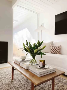
minimal-coffee-table-styling-with-tray-plant-and-books.
Choosing a Color Scheme Around Your Sofa
In most living rooms, the sofa is the largest visual element. Because of its size, it naturally influences every other color in the room.
Rather than choosing wall paint first, many designers recommend starting with the sofa. Once its color is established, selecting complementary wall colors, rugs, curtains, and decorative accessories becomes much easier.
For example, a beige sofa pairs beautifully with warm whites, oak furniture, and earthy accessories that reinforce a calm atmosphere.
A grey sofa offers remarkable flexibility, working equally well with soft neutrals, deep blues, muted greens, or natural wood finishes.
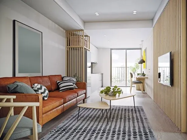
Homes with a brown leather sofa often benefit from creamy walls, textured linen fabrics, and warm wood tones that emphasize leather’s timeless character.
If you’re considering a colored sofa, subtle greens and muted blues usually remain versatile because they behave almost like sophisticated neutrals while introducing additional personality.
Starting with your largest furniture piece creates a palette that feels cohesive from the beginning rather than assembled gradually without a clear direction.
Adding Depth Through Layered Tones
A room built entirely from a single neutral color may feel flat. Depth emerges when several related tones appear across the space.
For example, a living room might include:
-
warm beige walls
-
a slightly darker sofa
-
cream-colored cushions
-
natural wood furniture
These subtle variations maintain harmony while preventing the space from feeling monotonous.
Layering tones also helps the eye move naturally around the room, reinforcing a calm and balanced environment.
Accent Colors That Can Evolve
Accent colors add personality without locking the entire room into a fixed palette.
Instead of choosing bold furniture pieces, accents are best introduced through elements that are easy to replace:
-
cushions
-
throws
-
artwork
-
decorative objects
Muted greens, soft terracotta, dusty blues, and warm browns work well because they connect naturally with materials like wood, linen, and wool.
Over time, these accents can change without requiring a complete redesign.
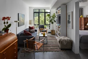
Color Schemes for Different Decorating Styles
Different decorating styles often rely on different color relationships, even when they share similar furniture.
| Style | Typical Color Palette |
|---|---|
| Scandinavian | White, beige, light oak, soft gray |
| Organic Modern | Greige, olive green, warm wood, stone |
| Japandi | Cream, taupe, charcoal, natural oak |
| Coastal | White, sand, pale blue, driftwood tones |
| Traditional | Cream, walnut, muted green, navy |
| Contemporary | Soft gray, black accents, white, natural textures |
Rather than copying a room exactly, use these palettes as inspiration. Adapting the color relationships to your own furniture creates a home that feels personal while remaining visually balanced.
Natural Materials Support Balanced Color
Materials strongly influence how colors appear in a living room. Wood, linen, wool, leather, and stone introduce subtle tonal variations that soften the overall palette.
For example:
-
oak furniture adds warm undertones
-
linen textiles create light texture
-
wool rugs provide depth and softness
These materials prevent neutral color schemes from feeling sterile while maintaining a calm atmosphere.
Because natural materials age gracefully, they also reinforce the long-term stability of the room’s design.
Repeating Colors Across the Room
Consistency helps a color palette feel intentional rather than accidental.
Repeating tones across different elements creates visual rhythm.
A simple approach might include:
-
matching cushion tones with artwork
-
repeating wood tones across furniture
-
echoing accent colors in small decorative objects
These connections guide the eye through the room and reinforce overall harmony.
Light and Color Interaction
Natural light changes how colors appear throughout the day.
Morning light tends to be cooler, while evening light often appears warmer. Choosing colors that adapt well to these shifts helps maintain a consistent atmosphere.
Soft neutral tones perform particularly well because they reflect light gently without becoming overpowering.
Testing paint samples in different lighting conditions can prevent surprises once the room is fully decorated.
How Natural Light Changes Every Color Scheme
Natural light has a greater influence on color than many homeowners expect. The same paint color can appear warm, cool, bright, or muted depending on the room’s orientation and the time of day.
Rooms that face north typically receive cooler, softer light. Warm neutrals such as beige, creamy white, and soft greige often help balance this effect by creating a more welcoming atmosphere.
South-facing rooms usually enjoy abundant daylight throughout the day. These spaces comfortably support cooler neutrals like soft gray, crisp white, or muted taupe because the natural light already introduces warmth.
East-facing living rooms receive bright morning sunlight before becoming more neutral during the afternoon. Flexible color schemes perform particularly well here because they remain balanced as lighting conditions change.
West-facing rooms experience the opposite effect. They often feel more neutral during the morning before becoming significantly warmer later in the day. Extremely yellow or orange paint colors may become overly intense during sunset hours.
Rather than choosing colors from small paint chips alone, observe how natural light moves through the room. The same palette may feel completely different depending on orientation, window size, and seasonal changes.
Quick Guide to Natural Light
| Room Orientation | Recommended Color Direction |
|---|---|
| North-facing | Warm neutrals like beige, cream, and greige |
| South-facing | Soft gray, white, and balanced neutrals |
| East-facing | Flexible neutral palettes with gentle contrast |
| West-facing | Soft balanced colors that avoid excessive warmth |
Avoiding Trend-Driven Palettes
Many color trends emerge quickly through social media and design magazines. While some trends remain appealing, others fade within a few years.
Examples of trend-driven palettes include extremely saturated colors or overly contrasting combinations that dominate the entire room.
Timeless color schemes avoid relying too heavily on any single trend. Instead, they prioritize balance and flexibility so the room can evolve gradually.
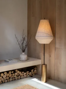
Warm vs Cool Color Schemes
Choosing between warm and cool palettes is often more important than choosing individual colors.
Warm palettes feel welcoming and relaxed. They typically include creamy whites, warm beige, terracotta, caramel, and natural wood.
Cool palettes create a cleaner and more contemporary appearance through soft grays, crisp whites, muted blues, and charcoal accents.
| Warm Palette | Cool Palette |
|---|---|
| Cream | Soft white |
| Beige | Light gray |
| Oak | Black accents |
| Terracotta | Navy blue |
| Cozy atmosphere | Fresh atmosphere |
Neither approach is universally better. The right choice depends on your home’s lighting, furniture, and the atmosphere you hope to create.
Common Mistake: Too Many Colors
One of the most common decorating mistakes is introducing too many colors at once.
When a room contains numerous competing tones, the space can feel visually chaotic. Limiting the palette to three or four primary tones usually creates better balance.
For example:
-
base neutral
-
secondary neutral
-
one accent color
-
optional natural wood tone
This structure maintains clarity while still allowing the room to feel expressive.
Decision Guide: Which Color Scheme Fits Your Home?
If your living room receives limited natural light, warm neutrals usually create a softer and more welcoming atmosphere.
If you enjoy changing seasonal décor, neutral foundations with interchangeable accent colors provide the greatest flexibility.
If your goal is a modern appearance, cooler neutrals combined with black accents and natural textures create clean visual lines.
If comfort is your highest priority, earthy palettes with layered wood tones, linen fabrics, and soft textiles often feel the most inviting.
The best color scheme is rarely the trendiest one. It is the palette that continues supporting your everyday life long after the room is finished.
Everyday Life With a Balanced Color Palette
Color schemes influence daily comfort more than many people realize.
Soft neutral tones support relaxation in the evening. Balanced contrasts maintain visual clarity during daytime activities such as reading or working.
When colors feel harmonious rather than overwhelming, the room becomes easier to inhabit for long periods.
Over time, balanced palettes contribute to a home environment that feels stable, calm, and adaptable.
How to Test Paint Colors Before Making a Final Decision
Paint samples often look very different on a small card than they do across an entire wall. Before committing to a color, test several options directly in the room where they will be used.
Apply large sample areas on different walls rather than concentrating them in one spot. Observe how each color changes during the morning, afternoon, and evening, as natural light shifts throughout the day. A warm beige that feels inviting in the morning may appear much richer under evening lighting, while a cool gray can become brighter or flatter depending on the room’s orientation.
It’s also important to evaluate paint alongside the furniture, flooring, curtains, and rugs that will remain in the space. Colors never exist in isolation. Their appearance is influenced by every surrounding material and finish.
Whenever possible, live with your paint samples for a few days before making a final decision. Viewing them during everyday routines provides a much better understanding of how the finished room will feel over time than making a choice under showroom lighting.
Taking this extra step requires very little effort but often prevents costly repainting and helps create a living room color scheme that continues to feel balanced for years.
Practical Checklist Before Choosing Colors
Before finalizing a living room palette, consider a few practical factors:
-
evaluate how much natural light the room receives
-
observe how colors change throughout the day
-
choose furniture tones before finalizing wall color
-
limit the palette to a small number of tones
-
test paint samples on multiple walls
These steps help ensure the palette remains comfortable long after the room is finished.
If you want to deepen this approach, these guides explore how different strategies can simplify everyday routines while maintaining visual clarity.
• Why Storage Planning Should Come Before Decorating how structure creates long-term organization
• Bedroom Organization Ideas That Actually Work practical ways to maintain order in everyday spaces
• Apartment Organization Ideas for Small Homes how to organize compact spaces without losing comfort
• Functional Storage That Looks Good Too balancing visual simplicity with practical storage
• How to Keep Your Home Organized Long Term building habits that sustain organization over time
Together, these ideas help create a home that stays organized naturally, not through effort, but through systems that support daily life.
Frequently Asked Questions
What colors work best for a living room?
Neutral tones such as beige, warm gray, soft white, and muted taupe tend to work well because they adapt easily to different furniture styles and lighting conditions.
How many colors should a living room have?
Most balanced living rooms use three to four main tones, including a neutral base and one or two accent colors.
Are dark colors suitable for living rooms?
Dark colors can work well when balanced with lighter tones and adequate lighting. They often create depth and a more intimate atmosphere.
Editorial Conclusion
Living room color schemes that remain appealing over time rely on balance, flexibility, and thoughtful material choices. Neutral foundations combined with subtle tonal variation create environments that feel calm and adaptable.
A successful living room color scheme is not defined by the latest trend or the boldest statement. It is the palette that continues to feel welcoming through changing seasons, evolving furniture, and everyday routines. When colors are chosen with balance, flexibility, and comfort in mind, the living room becomes a space that remains beautiful not just today, but for many years to come.